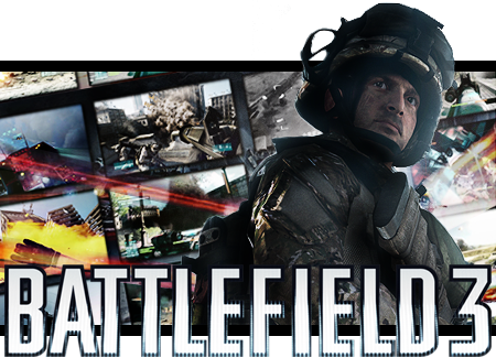
Nothing to grand pretty simple I think, All images and minor effects are from promotional material related to Battlefield 3, With some minor shading for the render. Would change some of the background images to reflect the new trailer but I did the BG weeks ago and cant be bothered to edit it again  .
.
Battlefield 3
Started by
Corporal Hicks
, Aug 17 2011 05:25 AM
9 replies to this topic
#1
Posted 17 August 2011 - 05:25 AM
#2
Posted 17 August 2011 - 06:20 AM
Looks sick dude, very cool. I honestly don't think I could have done it as good as this myself, major props considering I know how ring rusty you are with GFX, lol. Reminds me of the old MoH one I did for you but you've really improved on the background montage idea I had with the styling and how they pop out from a base background image. The shading really works on the main render as well, though it is a tad unnatural but it still works. The logo is nicely placed... I've got nothing bad to say about this piece. I love it, lol.
#3

Posted 17 August 2011 - 07:54 AM
How the hell do you create pop out sigs?
As for the sig it looks wicked. Not a big fan of Battlefield but I like the effects you used. The lighting is really nice too. Gives it a nice touch. The text also works aswell. Props for this!
BTW do you think you can make me a Cena sig like that? *hint hint*
As for the sig it looks wicked. Not a big fan of Battlefield but I like the effects you used. The lighting is really nice too. Gives it a nice touch. The text also works aswell. Props for this!
BTW do you think you can make me a Cena sig like that? *hint hint*
#4
Jittery Blanket
-
- Code-X Member
-

- 10,090 posts
Like a cat.. without a care..
- Gender:Not Telling
Posted 17 August 2011 - 08:58 AM
So... where's my pixel? 
#5
EndZone
-

- Code-X Member
-

- 4,828 posts
Insert something witty or clever here.
- Gender:Male
Posted 17 August 2011 - 09:10 AM
It's okay. I like the background but feel there should be something more to it. Also, the sig's size, I have no idea why, but it just feels.... awkward for lack of a better word.
The sig's not bad, but I think it needs a bit more.
How the hell do you create pop out sigs?
Make the sig you want. Save it as a .png file. Open it in a new document and make it a bit taller than you made the sig, so for example, if the sig was 500 pixels high originally, make it something like 600-650 pixels high. Next, open up the render you wanna use and just put it in the sig and blend it to your liking. Save that as a .png file and voila.
Edited by EndZone, 17 August 2011 - 09:13 AM.
#6
Posted 17 August 2011 - 01:09 PM
@Ryan The MoH sig was kinda my inspiration, For a while I wanted to do a sig like that but finding a theme and inspiration was hard. But I can say I managed it after a while lol.
@Cam Look at Endzones post on how to do it. As for the request probably not its rare that I make signatures and they have to relate to things I like personally, Not much of a wrestling fan these days.
@JB May have been lost in the post, Ill send another one out to you.
@EZ The size is due to the background if I would have made it smaller then I wouldn't have been able to pack in all the images in that I wanted, I just wanted something simple I was going to add more to it but I liked the simplicity of it.
Thanks for the replys so far guys.
#7
EndZone
-
- Code-X Member
-
- 4,828 posts
Insert something witty or clever here.
- Gender:Male
Posted 17 August 2011 - 03:33 PM
Ah, okay. It works well, actually, now that I've looked at it again.
If you want, Cameron, I could tackle that request for ya.
If you want, Cameron, I could tackle that request for ya.
#8

Posted 17 August 2011 - 04:20 PM
Vintage Hicks... You always have a way of making things look "official" and this is no different. Everything just fits together very well for an all around polished look. Text may have room for improvement, I don't think the vertical lines on it goes very well with the rest of the piece. But overall good job, love it.
#9
Posted 17 August 2011 - 09:38 PM
 Corporal Hicks, on 17 August 2011 - 01:09 PM, said:
@Cam Look at Endzones post on how to do it. As for the request probably not its rare that I make signatures and they have to relate to things I like personally, Not much of a wrestling fan these days.
EndZone, on 17 August 2011 - 03:33 PM, said:
If you want, Cameron, I could tackle that request for ya.

Edited by Cameron™, 17 August 2011 - 09:40 PM.
#10
Posted 18 August 2011 - 05:19 AM
@Showtime Not much I can do with the text as its the logo for the game, I kinda come a bit stuck when I noticed the lines, Was thinking of adding scan lines to the piece set low enough to make it work but I didn't think it was going to turn out that good so I never did it.


