


Gangsta Rap Made Me Do It
Started by
Shyseven
, Nov 29 2008 12:18 AM
7 replies to this topic
#2
Ollie The Magic Bum
-

- Code-X Member
-

- 4,091 posts
BALL DON'T LIE!
- Gender:Male
- Location:Truth or Consequences, NM
- Gallery:View
Posted 29 November 2008 - 12:39 AM
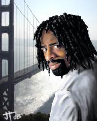
The cut of Ice Cube looks very separate from the background. The text isn't very good. There's no flow to it at all. Everything is very separate.

#4
MC Coemgen
-

- Code-X Member
-

- 14,431 posts
The Official Un-Official Code-X Legend
- Gender:Male
- Location:Cook County
- Code-X History: Former Moderator
- Facebook:Like Me
Posted 30 November 2008 - 01:33 PM
The text needs some work, the left side is a little plain and boring, try adding something over there. And like Ollie said, make everything flow better.
#8

Posted 02 December 2008 - 06:13 PM
 Ollie The Magic Bum, on Nov 28 2008, 06:39 PM, said:
The cut of Ice Cube looks very separate from the background. The text isn't very good. There's no flow to it at all. Everything is very separate.


